Update array layout style #1
Conversation
Derive the version very clearly from the upstream version on which it is
based
Move add new item button to bottom-left
Apply new arraylist.container class(es)
Remove default "no data" message
Remove 0 elevation from parent card wrapper
Conditionally show validation error avatars on list title
There was a problem hiding this comment.
In general it makes a lot of sense to align the title to the left! So I'm fine with that.
However the combined end result of the changes is not that great I think:
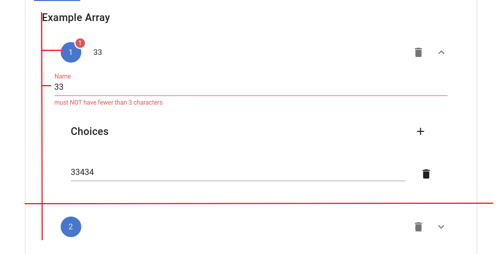
- the title is aligned but the array items are intended
- the controls within the array items are intended less than their title
- there is no more hover effect so it's hard to see that this are expandable sections
- it's difficult to see where one item ends and the next array entry starts
To note: You might not want to introduce so many package-lock.json changes.
| # JSON Forms Vuetify renderers | ||
|
|
||
| This is a monorepo containing the JSON Forms Vue 2 Vuetify renderers and an example application. | ||
| This is a fork of the monorepo containing the JSON Forms Vue 2 Vuetify renderers and an example application. |
There was a problem hiding this comment.
We should also adapt the vue2-vuetify README as that is the one which is shown on npm, i.e. indicate that this is a fork.
| { | ||
| "name": "@jsonforms/vue2-vuetify", | ||
| "version": "3.0.0-beta.2", | ||
| "name": "@yaffol/vue2-vuetify", |
There was a problem hiding this comment.
You also need to consume this version in the example app package.json and code to test it locally
| <validation-icon | ||
| v-if=" | ||
| control.childErrors.length > 0 && | ||
| appliedOptions.showValidationOnArrayTitles |
There was a problem hiding this comment.
It's good to make this configurable. I would call it showArraySummaryValidation. For a contribution we should add this to the example app configuration block to make this easily testable.
| accordion | ||
| focusable | ||
| v-model="currentlyExpanded" | ||
| flat |
There was a problem hiding this comment.
I'm not sure about forcing the flat style for everyone. I would rather see this as a configuration option. We could let the user set arbitrary props like flat via the vuetifyProps mechanism, e.g. see here.
| <v-icon>mdi-plus</v-icon> Add new | ||
| </v-btn> | ||
| </template> | ||
| {{ `Add to ${control.label}` }} |
There was a problem hiding this comment.
I would like to see the translation support used here, but this could also be done in a follow up
| </v-container></v-card-text | ||
| > | ||
| </v-card-text> | ||
| <v-card-actions class="pb-8"> |
There was a problem hiding this comment.
I'm not sure about modifying the "new" button to the bottom for everyone. In most UIs we build it's at the top. However we could also make this configurable
| .v-expansion-panel-header:before { | ||
| background-color: inherit; | ||
| } |
There was a problem hiding this comment.
I would not add this here as discussed in the PR against @jsonforms/vuetify-renderers.
| </v-row> | ||
| </v-container> | ||
| <v-container v-if="noData" :class="styles.arrayList.noData"> | ||
| No data |
There was a problem hiding this comment.
Instead of removing this we could make it configurable or you could also just apply display: none to this on the application side to not show it. In general I think it's nice to somehow show that an array is empty.
Move add new item button to bottom-left
Apply new arraylist.container class(es)
Remove default "no data" message
Remove 0 elevation from parent card wrapper
Conditionally show validation error avatars on list title