Modern Themes #704
Modern Themes #704
Conversation
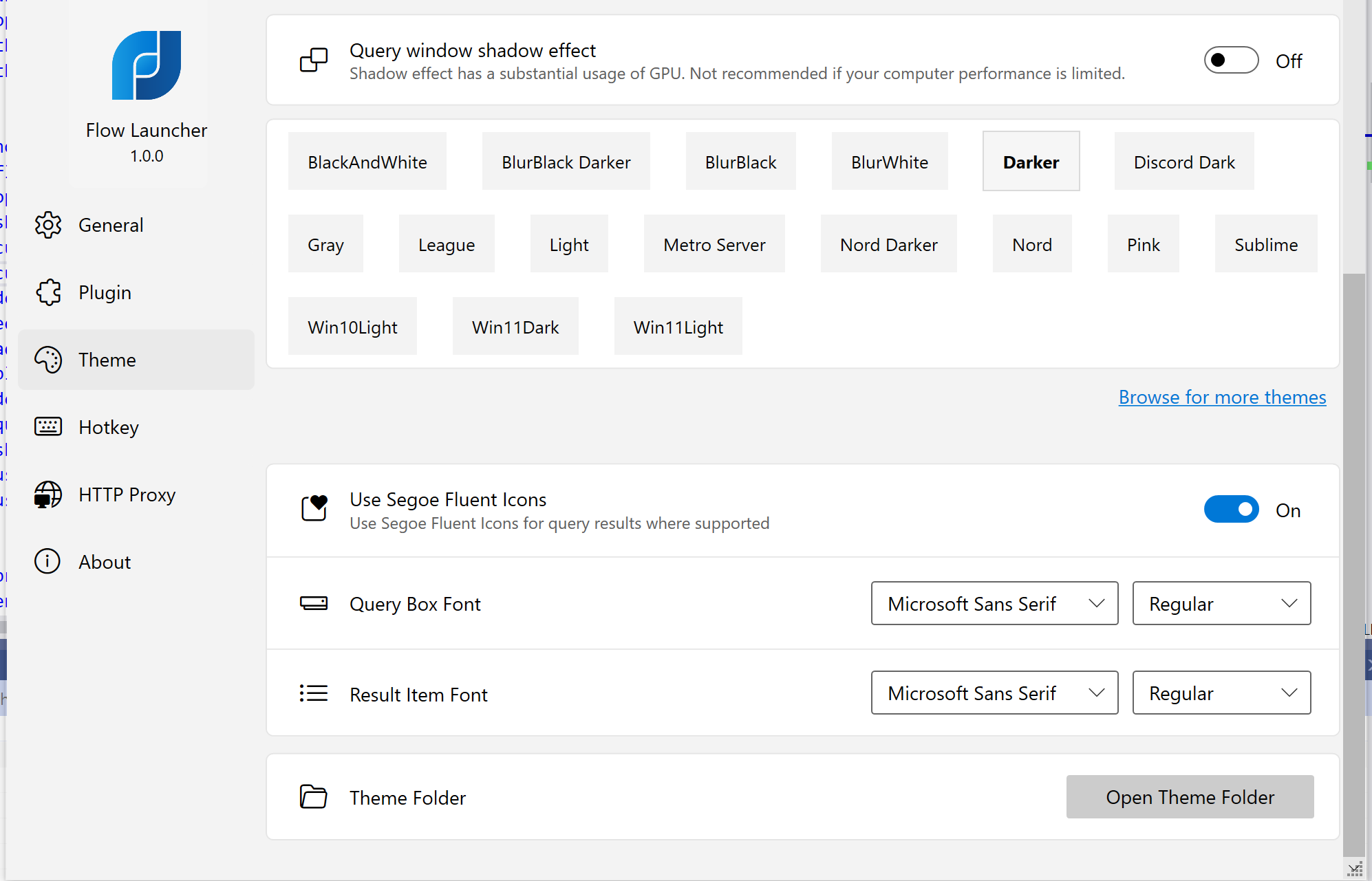
- Add Hightlight Styling
- Add New Themes and adjust classic themes
|
Wow, that's a huge change😲 |
| effectSetter.Property = Border.EffectProperty; | ||
| effectSetter.Value = new DropShadowEffect | ||
| { | ||
| Opacity = 0.9, |
There was a problem hiding this comment.
Could you provide a screenshot for people to check the effect of this change?
There was a problem hiding this comment.
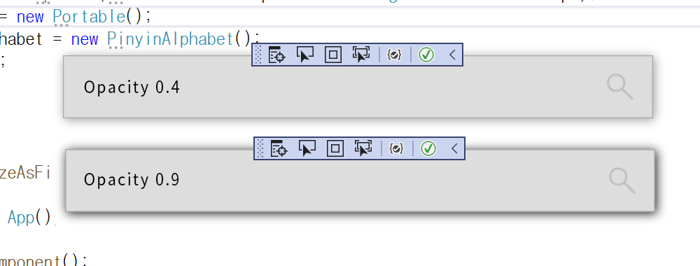
It turned into a softer shadow. I tried to give it a feeling that is commonly used in modern Windows.
| @@ -1,11 +1,12 @@ | |||
| using System; | |||
| using System.Windows;using System; | |||
| //textBlock.Inlines.Add(new Bold(new Run(currentCharacter))); | ||
| //textBlock.Inlines.Add(new Run(currentCharacter) { Foreground = Brushes.RoyalBlue }); |
Flow.Launcher/Flow.Launcher.csproj
Outdated
| <Page Remove="Themes\League.Designer.xaml" /> | ||
| <Page Remove="Themes\League.xaml" /> | ||
| <Page Remove="Themes\ThemeBuilder\Template.xaml" /> | ||
| <Page Remove="Themes\Win11Dark.Designer.xaml" /> | ||
| <Page Remove="Themes\Win11Dark.xaml" /> |
There was a problem hiding this comment.
Will it be considered as page? Why previous theme don't need to be remove here?
There was a problem hiding this comment.
I didn't know there was something like this. I'm going to erase it.
| <KeyBinding Key="D9" Modifiers="{Binding OpenResultCommandModifiers}" Command="{Binding OpenResultCommand}" CommandParameter="8"></KeyBinding> | ||
| </Window.InputBindings> | ||
| <Grid> | ||
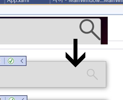
| <Border Style="{DynamicResource WindowBorderStyle}" MouseDown="OnMouseDown" CornerRadius="5" > |
There was a problem hiding this comment.
Same. Probably a screenshot for this change may be better. (probably visual studio has xaml hot reload so this can be done easily).
There was a problem hiding this comment.
Radius could not be changed in the theme because that code first. The setting was removed to allow the theme to be managed. Depending on the theme xaml., it will be round or square.
Flow.Launcher/MainWindow.xaml
Outdated
| </TextBox> | ||
| <svgc:SvgControl Source="{Binding Image}" HorizontalAlignment="Right" Width="42" Height="42" | ||
| Background="Transparent"/> | ||
| <svgc:SvgControl Source="{Binding Image}" HorizontalAlignment="Right" Width="25" Height="25" Margin="0,2,18,0" Opacity="0.2" Background="Transparent" Style="{DynamicResource SearchIconStyle}"/> |
There was a problem hiding this comment.
It may not be seen well in some Themes, but it has been the same before. In the future, I will try to make it visible according to the theme.
There was a problem hiding this comment.
Probably make this editable and edit it in theme file instead of the MainWindow.xaml
|
|
||
| public Visibility ShowOpenResultHotkey => | ||
| Settings.ShowOpenResultHotkey ? Visibility.Visible : Visibility.Hidden; | ||
| Settings.ShowOpenResultHotkey ? Visibility.Visible : Visibility.Collapsed; |
There was a problem hiding this comment.
What's the different between these two?
There was a problem hiding this comment.
- I increased the area of the hot key.
- I tested the 'Do not display hotkey' option, but the hotkey area is reserved. ('Hidden' Property makes it like this.) In this case, the title area does not fit the width of the window. (it make a gap on the right side.)
- the code make responsive width the title area and remove gap.
There was a problem hiding this comment.
Collapsed: Do not display the element, and do not reserve space for it in layout.
Hidden: Do not display the element, but reserve space for the element in layout.
|
No not a big deal. Just remove some empty line will be fine. I will take a look on the effect tonight 😃 |
|
@onesounds this look is really good, very nice! thank you. @taooceros @onesounds would it be possible to make this change backwards compatible with the current themes? Also there is a request to make the magnifying glass swappable with another image via the xaml file, if not hard let's add to this change? |
- change the code for compatible classic themes (You can use it without modifying the classic theme.)
- add default window radius(5) for classic themes
- add default hotkey color
- but still default
- New themes are used in a way that redefines the base code by changing and including it.
- The basic height and each item spacing had to be changed. This part should also be changed to a theme.
…so I choosed and applied right color for classic themes.- Rollback Classic Skins

- change the code for compatible classic themes (You can use it without modifying the classic theme.)
- add default window radius(5) for classic themes
- add default hotkey color
- but still default hotkey color not same subtitle color in classic themes, (because base xaml can't read theme xaml) so I choosed right color for classic themes and applied it. I think it's not bad.
- New themes are used in a way that redefines the base code by changing and including it.
- The basic height and each item spacing had to be changed. This part should also be changed to a theme.
…margin, size, color, option, etc).

- If you want to erase it, adjust the opacity.
- Geometry type data (svg to xaml) was inserted into base.xaml.
- If there is no data, use the one in the base.
- The top margin of the list box was adjusted under the theme.n to changable b
| switch (Visbility) | ||
| { | ||
| case Visibility.Collapsed when Results.Count > 0: | ||
| Margin = new Thickness { Top = 8 }; |
There was a problem hiding this comment.
This part gives the margin of the list list and query box. In the absence of a seperator (classic themes), vertical centering seems to be out of place, so it was removed. It can be added as the Margin of the theme's basis separator attribute, and in recent themes, it is displayed with the separator.
Flow.Launcher/Themes/Win10Light.xaml
Outdated
| <Setter Property="Background" Value="Transparent" /> | ||
| <Setter Property="HorizontalAlignment" Value="Right" /> | ||
| </Style> | ||
| <Geometry x:Key="SearchIconImg">F1 M12000,12000z M0,0z M10354,10962C10326,10951 10279,10927 10249,10907 10216,10886 9476,10153 8370,9046 7366,8042 6541,7220 6536,7220 6532,7220 6498,7242 6461,7268 6213,7447 5883,7619 5592,7721 5194,7860 4802,7919 4360,7906 3612,7886 2953,7647 2340,7174 2131,7013 1832,6699 1664,6465 1394,6088 1188,5618 1097,5170 1044,4909 1030,4764 1030,4470 1030,4130 1056,3914 1135,3609 1263,3110 1511,2633 1850,2235 1936,2134 2162,1911 2260,1829 2781,1395 3422,1120 4090,1045 4271,1025 4667,1025 4848,1045 5505,1120 6100,1368 6630,1789 6774,1903 7081,2215 7186,2355 7362,2588 7467,2759 7579,2990 7802,3455 7911,3937 7911,4460 7911,4854 7861,5165 7737,5542 7684,5702 7675,5724 7602,5885 7517,6071 7390,6292 7270,6460 7242,6499 7220,6533 7220,6538 7220,6542 8046,7371 9055,8380 10441,9766 10898,10229 10924,10274 10945,10308 10966,10364 10976,10408 10990,10472 10991,10493 10980,10554 10952,10717 10840,10865 10690,10937 10621,10971 10607,10974 10510,10977 10425,10980 10395,10977 10354,10962z M4685,7050C5214,7001 5694,6809 6100,6484 6209,6396 6396,6209 6484,6100 7151,5267 7246,4110 6721,3190 6369,2571 5798,2137 5100,1956 4706,1855 4222,1855 3830,1957 3448,2056 3140,2210 2838,2453 2337,2855 2010,3427 1908,4080 1877,4274 1877,4656 1908,4850 1948,5105 2028,5370 2133,5590 2459,6272 3077,6782 3810,6973 3967,7014 4085,7034 4290,7053 4371,7061 4583,7059 4685,7050z</Geometry> |
There was a problem hiding this comment.
This is the data that changed svg to xaml. If there is no such part, use the base.xaml.
| <Setter Property="Foreground" Value="#000000" /> | ||
| </Style> | ||
| </ResourceDictionary.MergedDictionaries> | ||
| <Style x:Key="QueryBoxStyle" BasedOn="{StaticResource BaseQueryBoxStyle}" TargetType="{x:Type TextBox}"> |
There was a problem hiding this comment.
this theme(non edited), it works but have design problem. (inputbox full height)
|
|
||
|
|
||
| <Grid> | ||
| <Rectangle Width="Auto" HorizontalAlignment="Stretch" Style="{DynamicResource SeparatorStyle}" /> |
There was a problem hiding this comment.
Since the height cannot be given, a rectangle was used instead of a separator.
Flow.Launcher/MainWindow.xaml
Outdated
| Style="{DynamicResource PendingLineStyle}" Visibility="{Binding ProgressBarVisibility, Mode=TwoWay, UpdateSourceTrigger=PropertyChanged}" | ||
| Y1="0" Y2="0" X2="100" Height="2" Width="752" StrokeThickness="1"> | ||
| </Line> | ||
| Y1="0" Y2="0" X2="100" Height="2" Width="Auto" StrokeThickness="1"> |
There was a problem hiding this comment.
I haven't tested it, but progressbar will come out nicely as it is placed on the separator. you guys talking about using spinner, I think this is better.
There was a problem hiding this comment.
I tried to get the progress bar shown but either dont have too many files or the progress bar is not showing up, could both of you test when you get a chance please @taooceros
| <ColumnDefinition /> | ||
| <ColumnDefinition Width="0" /> | ||
| <ColumnDefinition Width="54" /> | ||
| <ColumnDefinition Width="*"/> |
There was a problem hiding this comment.
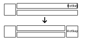
I changed list item layout. It looks good and solves the problem that the Title area invades the hot key area.
|
|
@onesounds just took it for a spin, love it. I see you added a couple more themes, looking good. Where you been all this time lol |
|
this is my first pull request. I'm not a programmer. I installed a visual studio 4 days ago to fix this design. When I went to the discord to make some design suggestion, @taooceros suggest me to make a pull request so I tried. (I always wondered why the open source software was so ugly, now that I look at it, I think it's just that there's no designer.) I'm happy you like it. anyway I have more Idea for design, I'll open discussion soon. |
| SubTitle = LnkResolvedPath ?? FullPath, | ||
| //SubTitle = LnkResolvedPath ?? FullPath, | ||
| SubTitle = "", |
There was a problem hiding this comment.
i am reverting this, we can do the subtitle changes in a seperate pr.
There was a problem hiding this comment.
@taooceros @onesounds we need implement support for users who dont have the glyph icons installed on their system. I will revert the glyph addition in this pr and we can add it in when implemented.
|
The glyph font is already added to resources, so just change the path will make it usable for everyone. |
|
i tried it (with absolute path) but didnt work, do i just point it directly at the file? |
We can I guess. Though I think if added to resources we can access that with relative path to the resources. |
|
@onesounds @taooceros I added the Glyph icons back and fixed the path, just needed to also add I also added option to switch Glyph icons on/off for results.
@taooceros did you want to take another look or happy for me to merge this in? |
| private void InitProgressbarAnimation() | ||
| { | ||
| var da = new DoubleAnimation(ProgressBar.X2, ActualWidth + 100, | ||
| var da = new DoubleAnimation(ProgressBar.X2, ActualWidth + 150, |
There was a problem hiding this comment.
Finally Progress bar fixed. I think it's my last push in this branch. I'll do something other branch.
The fixed Width size was the problem. I mistook activewidth for window size.
So I changed let Progressbar bring the width of parent grid.
Adjust
To prevent the progress bar from appearing suddenly, I changed the start and end position to more than window size. In this case, it goes out of the screen, so clip bound was applied to parent grid. (Clip bound sadly only works in like this case. If this worked for selected item, I wouldn't have to suffer.)
I will be busy for two days because of the exams. So I can take a look on the pull request at friday or weekend, or if you think it ok, just merge it🧐. |
|
I am free now. Anything left? |
Yeah I'm very happy with this change, maybe have a quick look if I missed anything and take it for a spin to ensure nothing has regressed. |
Sure, I will finish that by tomorrow |
3 participants
Also closes #661