Dojo(admin) Create lessons home page. Part 1: Lesson Card #1989
Conversation
|
@HS-90 is attempting to deploy a commit to the c0d3-prod Team on Vercel. A member of the Team first needs to authorize it. |
|
The latest updates on your projects. Learn more about Vercel for Git ↗︎
|
Codecov Report
@@            Coverage Diff            @@
##            master     #1989   +/-   ##
=========================================
  Coverage   100.00%   100.00%
=========================================
  Files          168       169    +1
  Lines         2881      2886    +5
  Branches       760       761    +1
=========================================
+ Hits          2881      2886    +5
|

| export const Basic = () => { | ||
| return ( | ||
| <AdminLessonCard | ||
| heading={props.heading} |
There was a problem hiding this comment.
can you try doing {...props}
| description: string | ||
| pendingFlaggedQuestions: number | ||
| editLessonUrl: string | ||
| width?: string |
There was a problem hiding this comment.
why are width and height strings?
There was a problem hiding this comment.
I thought in React when you set it to a px or % it needed to be in a string format
| return ( | ||
| <div | ||
| className={styles.container} | ||
| style={{ width: `${width}`, height: `${height}` }} |
There was a problem hiding this comment.
Is there a need for AdminLessonCard to take in width and height props?
There was a problem hiding this comment.
I was taking into consideration when designing the overall page i may need to customize the size of the component
| <Link href={editLessonUrl}> | ||
| <button | ||
| className="btn btn-secondary" | ||
| style={{ color: '#5440D8', fontWeight: 700 }} |
There was a problem hiding this comment.
Why do you set css through inline styling here, and then everywhere else you set it through className(except for the dynamically set width and height on line 25)?
There was a problem hiding this comment.
my thought process was that it was only a couple of lines to get the button to appear how i wanted vs alot more for the other elements, but i can revise this to make it consistent with the rest.
There was a problem hiding this comment.
Consistency makes life easier for future engineers debugging your code, I vote for that.
| pendingFlaggedQuestions, | ||
| editLessonUrl, | ||
| width, | ||
| height |
There was a problem hiding this comment.
Did you know that component prop design is part of the front end system design? https://youtu.be/9aOXGE7wAZo?t=645
I would have designed this differently because:
- This is specific to a lesson (per the component name description). Therefore, I think the heading / description / url should be handled within the component. This way, your component simply takes a
lessonProp. - This is specific to the admin page. Therefore, adding customization is a bit of overkill. Customization ability should only be added in when a component is made to be super generic. I would take out width/height.
So for propes I would have:
lesson, pendingFlaggedQuestions and that's it
There was a problem hiding this comment.
That's good to know.
I was taking into consideration when designing the overall page i may need to customize the size of the component amongst other things.
Is there a way for me to view an example of the deconstructed items of a lesson object?
There was a problem hiding this comment.
i may need to customize the size of the component amongst other things.
I would add the width/height when I actually have a use case /need for custom sizing. Otherwise I may be over engineering the component.
Here's a page using Lesson data type: https://github.com/garageScript/c0d3-app/blob/master/pages/curriculum.tsx#L19
Lesson Type Defined here: https://github.com/garageScript/c0d3-app/blob/master/graphql/index.tsx#L86
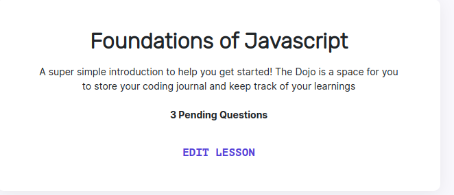
| lesson: { | ||
| title: 'Foundations of Javascript', | ||
| description: 'A super simple introduction to help you get started!', | ||
| docUrl: undefined, |
There was a problem hiding this comment.
i dont think this field needs to be passed if it is passed as undefined. Since the type definition says it is an optional field
added expect.assertions(1) to test
should've been expect.assertions(2)
scss/adminLessonCard.module.scss
Outdated
| flex-direction: column; | ||
| justify-content: center; | ||
| align-items: center; | ||
| padding: 2% 3% 2% 3%; |
There was a problem hiding this comment.
Why percent rather than px? It's unusual to set the padding or margin as a percentage.
There was a problem hiding this comment.
I was using % thinking the padding would dynamically adjust on the page depending on how large the overall component will be. I initially thought using a fixed px might make it not as scalable when taking into account the eventual adjustment in size to fit into the lessons home page. I can change to px if this is best practice.
There was a problem hiding this comment.
px for padding is best practice, you want the padding to always be the same. Usually the only thing that changes with screen size is:
- the text should scale with screen size
- Overall layout of the page should change with screen size
scss/adminLessonCard.module.scss
Outdated
| justify-content: center; | ||
| align-items: center; | ||
| padding: 2% 3% 2% 3%; | ||
| background: #ffffff; |
There was a problem hiding this comment.
NIT: To stay consistent, I would import colors.$bg-light from colors.module.scss.
scss/adminLessonCard.module.scss
Outdated
|
|
||
| .container__heading { | ||
| font-family: Rubik; | ||
| font-style: normal; |
There was a problem hiding this comment.
This property can be removed, as it's normal by default.
scss/adminLessonCard.module.scss
Outdated
| text-align: center; | ||
| flex: none; | ||
| order: 0; | ||
| flex-grow: 0; |
There was a problem hiding this comment.
flex, order, and flex-grow can be removed. Figma adds unnecessary CSS properties to the auto-generated CSS.
scss/adminLessonCard.module.scss
Outdated
| } | ||
|
|
||
| .container__button { | ||
| color: #5440d8; |
There was a problem hiding this comment.
Use HSL rather than HEX, as it's human-readable.
scss/adminLessonCard.module.scss
Outdated
| flex-direction: column; | ||
| justify-content: center; | ||
| align-items: center; | ||
| padding: 30px 53px 30px 53px; |
There was a problem hiding this comment.
A shorthand would be padding: 30px 53px
There was a problem hiding this comment.
This should be updated
scss/adminLessonCard.module.scss
Outdated
| font-family: Inter; | ||
| font-size: 14px; | ||
| margin-bottom: 3%; | ||
| margin-top: 2%; |
| <div className={styles.container__heading}>{title}</div> | ||
|
|
||
| <div className={styles.container__description}> | ||
| {description} The Dojo is a space for you to store your coding journal |
There was a problem hiding this comment.
The Dojo is a space for you to store your coding journal and keep track of your learnings <- take this out please, I think we only want to display the description
|
rebuild |
4 participants
Title: enhancement : Create a lessons homepage with Lesson Card components for Dojo(Admin).
Description:
Related to #1959
Create a lessons homepage with the ability to Add New Lessons, Edit Lessons, view questions from students for each lesson.
Note: In the initial PR, only the new admin Lesson Card will be submitted. Upon approval of the Lesson Card, the Lessons home page will be created and submitted in the following PR.
AdminLessonCard Component screenshot: