Fix pagination UI #512
Fix pagination UI #512
Conversation
Codecov Report
@@           Coverage Diff           @@
##             main     #512   +/-   ##
=======================================
  Coverage   85.36%   85.36%
=======================================
  Files         763      763
  Lines       15673    15674    +1
  Branches     1991     1991
=======================================
+ Hits        13379    13380    +1
  Misses       2261     2261
  Partials       33       33
Continue to review full report at Codecov.
|

| .small-square { | ||
| height: 32px; | ||
| width: 32px; | ||
| min-width: auto; |
There was a problem hiding this comment.
Is it only different from small class by width and min-width? Can we achieve the same result with the small class?
There was a problem hiding this comment.
After implementing the-toggle-button-group instead of ht-button I removed all changes in button component and defined styles for pagination buttons in parent component
| public highlightSelected: boolean = true; | ||
|
|
||
| @Input() | ||
| public type?: SelectType; |
There was a problem hiding this comment.
Instead of introducing a new input, can the component set the width of the popover content dynamically to match the width of its trigger element? This would be useful at few other location.
There was a problem hiding this comment.
I agree about not introducing a new input, but I would actually think set the width based on the width of the options provided - why make it wider than the widest option (with some max-width) ?
There was a problem hiding this comment.
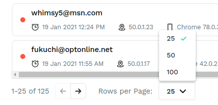
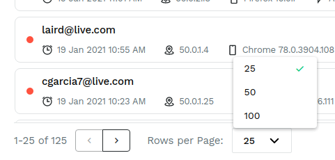
Now popover content of select has min-width equal to width of trigger element. Example how it look not in pagination component.
Previous:
Current:
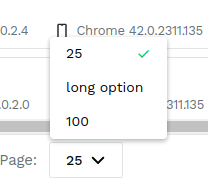
If option in popover wider than trigger element:
| display: flex; | ||
| margin: 0 24px 0 12px; | ||
| ::ng-deep { | ||
| .toggle-button-group { |
There was a problem hiding this comment.
I guess all of this is required because the paginator toggle has a slightly different style that toggle button component. @jake-bassett What should we do for this inconsistency?
There was a problem hiding this comment.
this is way too much reskinning IMO - there's a ton of class dependencies here that could easily change. I get that we sometimes need ng-deep, but at this point, I think using toggle is more likely to introduce breakages in the future and would rather either make the paginator style consistent with toggle or not use toggle in this component and implement the buttons as part of this component.
There was a problem hiding this comment.
+1 on not reusing a component if we need to modify it so heavily.
There was a problem hiding this comment.
aah. I kind of suggested to use toggle since the behavior was similar. I didn't know the styling of pagination buttons is so different. Should we instead look into combining the two styles form ux side?
There was a problem hiding this comment.
Yeah, I can see the draw of using the toggle, but the use cases are just a little different. Pagination is really two buttons visually tied together, but functionally independent. Toggles have one or more active states, possibly with the state of one button influencing the other buttons.
| display: flex; | ||
| margin: 0 24px 0 12px; | ||
| ::ng-deep { | ||
| .toggle-button-group { |
There was a problem hiding this comment.
this is way too much reskinning IMO - there's a ton of class dependencies here that could easily change. I get that we sometimes need ng-deep, but at this point, I think using toggle is more likely to introduce breakages in the future and would rather either make the paginator style consistent with toggle or not use toggle in this component and implement the buttons as part of this component.
…trace-ui into fix-pagination-ui
…trace-ui into fix-pagination-ui
 DmitiryPotychkin
dismissed stale reviews from anandtiwary and aaron-steinfeld
via
DmitiryPotychkin
dismissed stale reviews from anandtiwary and aaron-steinfeld
via
48b357c
| *ngSwitchCase="'${SelectTriggerDisplayMode.Icon}'" | ||
| class="trigger-content icon-only" | ||
| [ngClass]="this.selected !== undefined ? 'selected' : ''" | ||
| #triggerContainer |
There was a problem hiding this comment.
this is insane the triggerContainer on 48. Should it be removed?
There was a problem hiding this comment.
yes, forgot to remove. Fixed now
4 participants
Description
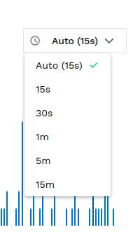
Previous:
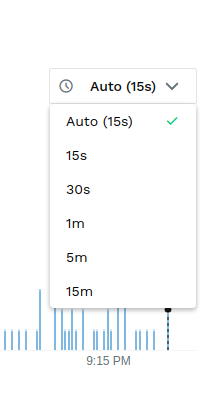
Now: