-
Notifications
You must be signed in to change notification settings - Fork 4.7k
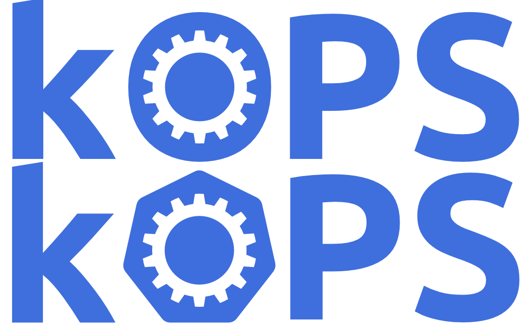
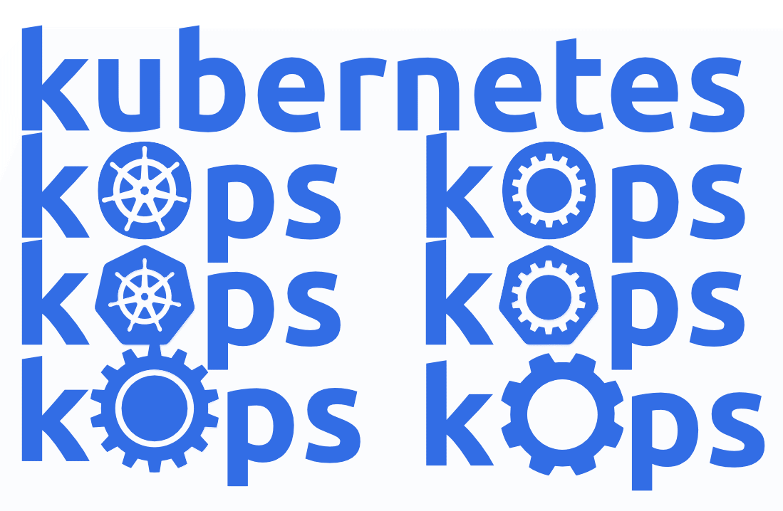
[WIP] Simplify the kops logo #10091
New issue
Have a question about this project? Sign up for a free GitHub account to open an issue and contact its maintainers and the community.
By clicking “Sign up for GitHub”, you agree to our terms of service and privacy statement. We’ll occasionally send you account related emails.
Already on GitHub? Sign in to your account
[WIP] Simplify the kops logo #10091
Conversation
|
[APPROVALNOTIFIER] This PR is APPROVED This pull-request has been approved by: hakman The full list of commands accepted by this bot can be found here. The pull request process is described here
Needs approval from an approver in each of these files:
Approvers can indicate their approval by writing |
2ad5aab to
005951a
Compare
|
I showed the old and suggested logo to someone with graphic design experience and got this feedback:
What is the typeface? Are there any particular color or design standards we are trying to follow? What are we trying to achieve (other then de-emphasizing the K)? |
|
Perhaps we could use as a design element a more modern helm, without protruding spokes? |
|
@johngmyers anything that looks better? |
|
If you want to emphasise the ops bit, maybe stylise it kOPS. |
|
The feedback I got was:
I suggested using the gear as an O and got "...maybe." I suggested using a punctuation graphic between the k and the O and got a better reception. "Perhaps a nonagon dot" |
|
Thanks for the feedback @johngmyers. Will do one more iteration. |
|
@justinsb will look into this, but will reopen if ever needed. |
|
@hakman: Closed this PR. In response to this:
Instructions for interacting with me using PR comments are available here. If you have questions or suggestions related to my behavior, please file an issue against the kubernetes/test-infra repository. |


Ref: #10077