Skip to content

Details added to existing operations #2558

New issue

Have a question about this project? Sign up for a free GitHub account to open an issue and contact its maintainers and the community.

By clicking “Sign up for GitHub”, you agree to our terms of service and privacy statement. We’ll occasionally send you account related emails.

Already on GitHub? Sign in to your account

Merged
merged 13 commits into from
Jul 28, 2022
Merged

Details added to existing operations #2558

merged 13 commits into from
Jul 28, 2022

Conversation

mshkolnik22
Copy link
Contributor

Description

User is able to see details of an existing operation

Type of change

Please delete options that are not relevant.

  • New feature (non-breaking change which adds functionality)

How Has This Been Tested?

Please describe the tests that you ran to verify your changes.

Self check in a browser.

Checklist:

  • My code follows the style guidelines of this project
  • I have performed a self-review of my own code
  • I have made corresponding changes to the documentation
  • I have added tests that prove my fix is effective or that my feature works

@mshkolnik22 mshkolnik22 self-assigned this Apr 29, 2022
Copy link
Contributor

@argaudreau argaudreau left a comment

Choose a reason for hiding this comment

The reason will be displayed to describe this comment to others. Learn more.

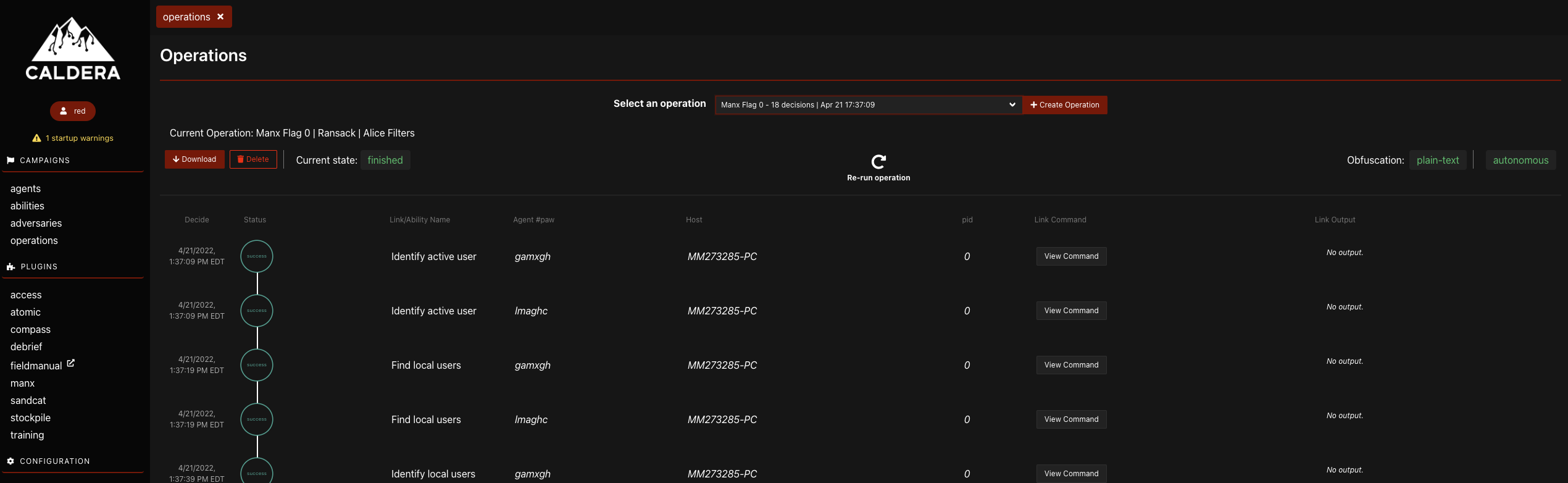
I'd like to see more details about the operation, specifically all the settings used in the Create Operation window, like:

  • Jitter
  • Fact source
  • Group
  • Parser
  • Auto close
  • Visibility
  • etc...

This kind of info would be best placed in a modal or popup, which would be opened via a button since space is limited on the line with the operation name. I'd recommend taking a look at what is returned from the GET request to get the current operation to see what kind of metadata it returns so you can get an idea of what to display.

@mshkolnik22 mshkolnik22 requested review from ZacharyLPalmer and removed request for iguannalin May 18, 2022 00:21
@argaudreau argaudreau requested a review from a team May 23, 2022 18:13
@sonarqubecloud
Copy link

Kudos, SonarCloud Quality Gate passed!    Quality Gate passed

Bug A 0 Bugs
Vulnerability A 0 Vulnerabilities
Security Hotspot A 0 Security Hotspots
Code Smell A 0 Code Smells

No Coverage information No Coverage information
No Duplication information No Duplication information

Copy link
Contributor

@ZacharyLPalmer ZacharyLPalmer left a comment

Choose a reason for hiding this comment

The reason will be displayed to describe this comment to others. Learn more.

I second what Adam said about more details about the operation being useful, the list of items he gave seems reasonable to me (and I am still getting a handle on all possible options)

In terms of how it displays I would favor a callout where you currently have it saying "Current Operation: <operation name" and then have an info icon or a details button that opens a popup or modal that displays the additional informaotin

image

Copy link
Contributor

@argaudreau argaudreau left a comment

Choose a reason for hiding this comment

The reason will be displayed to describe this comment to others. Learn more.

Just one small change, but otherwise looks good to me!

@mshkolnik22 mshkolnik22 requested a review from argaudreau June 23, 2022 16:02
@mshkolnik22
Copy link
Contributor Author

I made all the requested changes. Can you please take another look?

@sonarqubecloud
Copy link

Kudos, SonarCloud Quality Gate passed!    Quality Gate passed

Bug A 0 Bugs
Vulnerability A 0 Vulnerabilities
Security Hotspot A 0 Security Hotspots
Code Smell A 0 Code Smells

No Coverage information No Coverage information
No Duplication information No Duplication information

Copy link
Contributor

@argaudreau argaudreau left a comment

Choose a reason for hiding this comment

The reason will be displayed to describe this comment to others. Learn more.

The modal appears off in Firefox:
Screen Shot 2022-06-27 at 2 31 48 PM

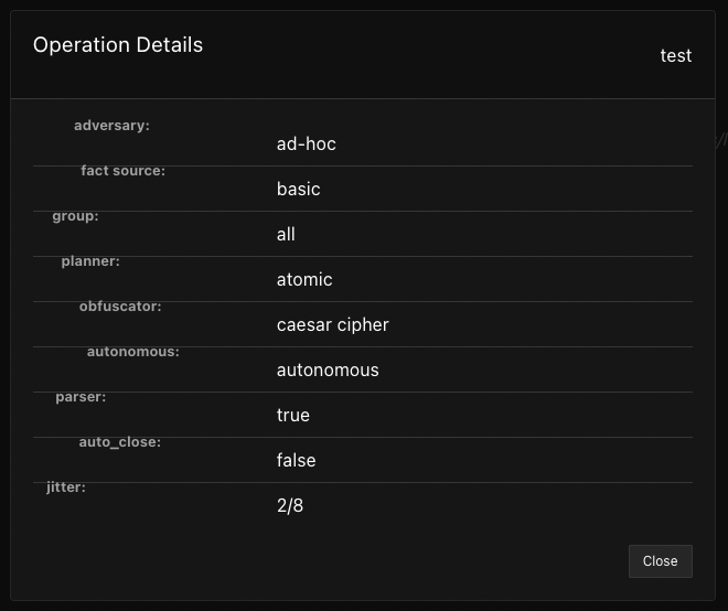
The More Details button might look better to the left of the download button, and if we move it there renaming it to "Operation Details" would be more explicit. The button as-is seems kind of jarring next to the text, so moving it to the button row below that would clean it up.

Copy link
Contributor

@ZacharyLPalmer ZacharyLPalmer left a comment

Choose a reason for hiding this comment

The reason will be displayed to describe this comment to others. Learn more.

Concur with adam on the button moving inline with download/delete. I looked at the modal in firefox and it didn't look off, so not sure why it's showing up like that for Adam. I would also say that having the operation name in line with the other information might make more sense, but I think it works either way.

@argaudreau argaudreau assigned argaudreau and unassigned mshkolnik22 Jul 13, 2022
Copy link
Contributor

@ZacharyLPalmer ZacharyLPalmer left a comment

Choose a reason for hiding this comment

The reason will be displayed to describe this comment to others. Learn more.

Looks good!

@argaudreau argaudreau enabled auto-merge (squash) July 28, 2022 15:00
@sonarqubecloud
Copy link

Kudos, SonarCloud Quality Gate passed!    Quality Gate passed

Bug A 0 Bugs
Vulnerability A 0 Vulnerabilities
Security Hotspot A 0 Security Hotspots
Code Smell A 0 Code Smells

No Coverage information No Coverage information
No Duplication information No Duplication information

@argaudreau argaudreau merged commit ae30d80 into master Jul 28, 2022
@argaudreau argaudreau deleted the ms-details-operation branch July 28, 2022 15:14
Sign up for free to join this conversation on GitHub. Already have an account? Sign in to comment
Labels
None yet
Projects
None yet
Development

Successfully merging this pull request may close these issues.

3 participants