Lollipop chart #417
Description
Description
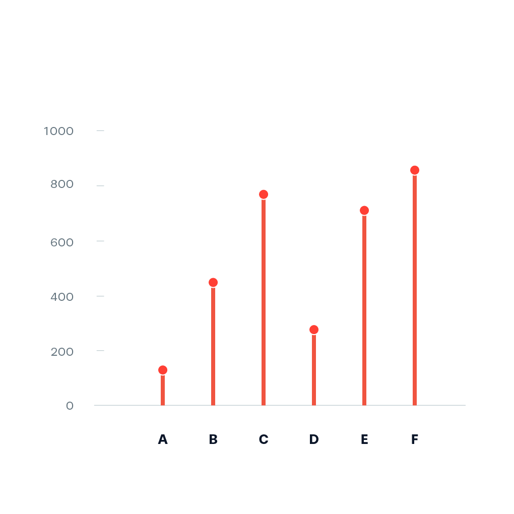
A Lollipop chart is a categorical chart that is basically a bar chart replaced by points being connected by a line to the zero-line of the reference axis representing the data. It can be helpful to reduce visual noise when all values have a similar height [1].
Example:
Pointers
- Ideally, you start prototyping in a scripting or notebook environment where you can iterate fast. installation instructions can be found here: https://plotly.net/#Installation
- Charts like this that are using baseline trace types to create a new chart type should only be implemented in the top-level Chart API. An example where this is already done is the Range chart that combines a set of differently styled line charts.
- When possible, use
#IConvertiblefor data input, as this allows forstrings, number types such asintandfloat, andDateTime.
References
Hints (click to expand if you need additional pointers)
- The most suitable base chart for this is a set of line charts that each connect the zero line to a data point
- The high-level function should look quite similar to the base implementation of
Chart.Bar