Create INS Fusion Tab [CPP-372] #177
Conversation
|
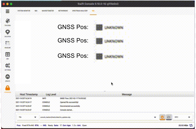
It's difficult to see what's on the screen, zoom-in is blurry. Can we schedule a demo and discussion? Typically INS tab would display status info, compass rose (yaw) and artificial horizon (roll and pitch). |
|
I think if we blow up the text center and make it all read left -> right it may look a bit better. Something like: |
8875cad to
4feaec2
Compare
|
Here's the beautifications so far.
|
2004af2 to
6f1f2d6
Compare
| AdvancedTabComponents.AdvancedSpectrumAnalyzerTab { | ||
| } | ||
|
|
||
| AdvancedTabComponents.AdvancedInsTab { |
There was a problem hiding this comment.
Hmm but this is in a StackLayout... nothing else should be showing but one of the items in this list...
| anchors.centerIn: parent | ||
|
|
||
| FusionStatusFlags { | ||
| } |
There was a problem hiding this comment.
I really don't like that across the app, you guys don't specify the anchors or sizing of components where you use them.
You should leave out the width, height, x, y, and any anchors from the base of the component you are defining, and leave it to the place where you use it to define that... And for FusionStatusFlags, that place where you use it is here ^^
I'll put another comment in FusionStatusFlags talking about it.
Ok - so for sizing here, this is in a ColumnLayout, so use the Layout.xxx attached properties for sizing and placement. The ColumnLayout will decide where to vertically place it, but you can tell it to fill any available height, which you should do in this case, since there's just this one component, and you want it to fill. Same with the width - you want it to fill the ColumnLayout
so, add the following:
Layout.fillWidth: true```
There was a problem hiding this comment.
I really don't like that across the app, you guys don't specify the anchors or sizing of components where you use them. You should leave out the width, height, x, y, and any anchors from the base of the component you are defining, and leave it to the place where you use it to define that... And for FusionStatusFlags, that place where you use it is here ^^
What is the impact of doing things this way? Perhaps we should capture this as a clean-up task through-out the QML code.
There was a problem hiding this comment.
When you make a .qml component, typically it is to be used as a reusable component to be used in more than one place (or at least, with the potential to use in more than one place).
You don't know what the parent is going to be - it could be a Layout, where setting explicit widths and heights doesn't make sense. If it happened to be paired with another component in a ColumnLayout, for instance, then setting the width and height to parent.width and parent.height makes no sense, and would make the second item in the ColumnLayout not show properly. It would also not be clear when you used it that that was the problem - since you wouldn't be looking at the component that set those (in this case FusionStatusFlags).
| property string last_zerovel: "UNKNOWN" | ||
|
|
||
| width: parent.width | ||
| height: parent.height |
There was a problem hiding this comment.
I see you removed the sizing of the Item* here, but didn't add any sizing to it where it's used in AdvancedInsTab.qml.
I think this might be where the weird placement you're seeing is happening. I'll comment in there to mention what you should add there.
- Which should be removed, see next comment.
There was a problem hiding this comment.
Please remove "WIP" from the PR title before merging. If there's any quick clean-ups from @keithel-qt that we can do, let's go ahead and do those, otherwise let's capture a story to address these clean-ups later.
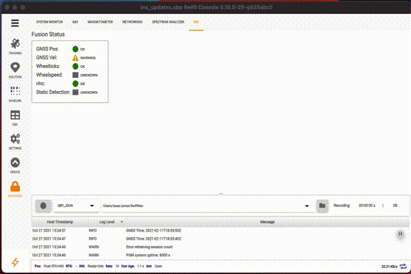
Moves fusion status to it's own tab and changes to a vertical
layout.
371f6f7 to
c904687
Compare
|
Thanks for your QML help. I've made some separate issues for a couple of your review items, specifically creating a reusable component for the Group Box, and I've also made a codebase wide issue to clean up instances where we're specifying layout properties (anchors, layout, width/height, etc), in the declaration of an item instead of when it gets used. |
Still a few things to do, like fixing up constants, and removing hardcoded values but I wanted to see if this was along the line of what we were thinking of for this tab and get feedback.