Keithel qt/orange styling tab info bar #250
Conversation
Theme/Theme.qml and Theme/qmldir is leftover from the flat style
example, and this kind of style customization I left out of the swiftnav
style.
Raise the SideNavBar highlight item so that is above the visualFocus
rectangle - so it will animate even when visualFocus is set.
It looked weird without this, however the end when it stops animating
when on a visualFocus SideNavButton also looks slightly weird.
* This creates a base qml `Tab` type that will be used for all main tabs
  within the application.
* Create properties within Tab for the sub-tab names that the tab will
  have (if any), and which sub-tab is the current one.

This is prep work to allow the sub-tabs of a tab to be held and
presented from a parent item of the current tab - having a common TabBar
showing sub-tabs for all main tabs, instead of having a TabBar within
each tab that has sub-tabs.

This is added to support the new design guidelines that have the TabBar
showing sub-tabs extend outside of the region that a Tab is contained
within (extending to the left, above the SideNavBar).
* Add a "TabInfoBar" that contains the sub-tabs of any views that have
  sub-tabs, instead of the tab bar being within those tabs.
* This is to comply to new "orange" SwiftNav design guidelines provided
  by Colin Maisonpierre.
* Communication of what tabs are to be shown is passed up through
  bound properties to the toplevel view, and then down into the new
  TabInfoBar.
* Similarly, communication of the currently selected tab is passed from
  TabInfoBar up to the toplevel view, and then down into the MainTabs
  and to the specific main tab through bound properties.

* A side-effect of this is that when the connection dialog is showing
  for the first time, no tab is selected at all - which is actually more
  accurate than the prior behavior, where the Tracking tab button was
  toggled on, but the connection screen was showing.
  Now, once the connection screen is dismissed, if the current index of
  the SideNavBar indicates nothing is selected (-1), then it will toggle
  the SideNavBar button with index Globals.initialMainTabIndex
  (presently Tracking tab).
* This adds the tab name to the left of the subtab tab names in the
  TabInfoBar. For now it's just a placeholder with static "TRACKING" as
  the text. Next commits will make that reflect the current main tab
  that is showing.
* This tweaks the TabBar styling, removing the border feature, and
  instead having the user of the TabBar define any borders.
* In TabInfoBar, we add vertical separators between each tab button in a
  different way than in other places - we just manually place them
  outside of the TabBar itself, layered ontop.
* Top and bottom separator lines are defined in the TabInfoBar for
  visual appeal and to separate the navigation bar from the main tab
  contents.
* Display the tab name selected in the SideNavBar in the TabInfoBar.
* Do not add any separators to TabInfoBar if there is no current tab
  showing (such as when the app first starts and is showing the connect
  dialog). Having a separator in that case looks funny, since it's not
  separating anything visible to the user.
* This adds placeholders for the branding informational items on the
  right of the TabInfoBar.
* This makes the TabBar within TabInfoBar invisible if there are no
  subtabs.
* First separator in TabInfoBar should be at the end of the tabLabel,
  instead of at the beginning of the tabBar. This is because when tabBar
  is not visible, tabBar's positioning doesn't change, even if
  tabLabel's width changes, which resulted in the first separator
  sometimes being painted in the middle of the tabLabel.
* With Qt Quick Controls 2's SplitView, you need to set the
  implicitWidth of each child in order for it to show the left split
  properly initially without resizing.
|
The font looks a little small on my screen maybe it is the contrast? Granted Im running a 4k screen. Also we might want to add some padding to the info icon as it looks like it is touching the edge. There was also a request to use "Observations" instead of "Obs" this could be crucial to your tab bar width. I had originally abbreviated it to reduce the width but was told we should not do this anymore. I do see the other tabs in which the subtabs are not using the top bar yet as you mention. I'm not sure what the plan should be for tabs that don't have subtabs, I fear there will be a lot of unused space. For example: What are your thoughts @silverjam |
Adding a gradient to the TabInfoBar and the TabButtons, as it looks more
professional and consistent, pairing well with the table headers in
various views.
* This tweaks the SwiftControlBackground so it's a wee bit darker, so
  that you can see the gradient in the TabInfoBar.
* This styles the connect button with a dark grey color matching the
  background of the SideNavBar, as per newest user interface guidelines.
The color used for a disabled SideNavButton was too dark in my opinion.
Replace it with a lighter color.

Also apply it to the connect button.
* Move references to modelData from SideNavButton to where it's used, as
  the modelData is only accessible from that particular usage of
  SideNavButton (the only one presently, but that may change).
* Improve the Connection button - so it's styled to the user interface
  guidelines.
* Add a status indicator to the SideNavBar according to the user
  interface guidelines.
 keithel-qt
force-pushed
the
keithel-qt/orange-styling-tab-info-bar
branch
from
keithel-qt
force-pushed
the
keithel-qt/orange-styling-tab-info-bar
branch
from
a68b5f4 to
e4b058d
Compare
* This displays the subtabs in the SolutionTab using the common subtab
  TabBar.
* This displays the subtabs in the AdvancedTab using the common subtab
  TabBar.
* Remove unnecessary Layout.fillWidth and Layout.fillHeight in
  TrackingTab
* This sizes sidebar buttons so they're wider than tall
* Making room for labeling the "Obs" tab button as it's full name of
  "Observations"
* Removes setting of the letterSpacing in the SideNavBarButtons.
  I left the setting of it, but at it's default value of 0, to give a
  hint to any future editors of this that they can alter the
  letter spacing if they wish.
* This removes the ColumnLayout in the toplevel view.qml, preparing for
  the TabInfoBar to be able to slide away when not needed.
* This adds opened and closed states to TabInfoBar, which allows the
  TabInfoBar to be hidden when it is not necessary.
* If the TabInfoBar has no subtabs present in it, once it is shown, it
  will automatically hide after 3 seconds, with a fluid close animation
  that pushes the TabInfoBar above and "underneath" the titlebar.
* If the user moves the mouse to within 10 pixels of the titlebar when
  the TabInfoBar is hidden, the TabInfoBar will be shown once again,
  animating with a fluid animation.
* To hide the bar manually, just click in an empty area of the
  TabInfoBar.
* Use Easing.OutQuad for TabInfoBar opened/closed transition.
* Speed up the open, leave close transition same length.
* Intentionally using a SideNavButton for the connect button as I want
  the styling to match. It is intentionally not part of the ButtonGroup
  that the tab buttons are in. Since there is only a single button in
  this "group", no need to create a ButtonGroup for it, however, we need
  to silence the warning since this is intentional. This provides a
  means for silencing the warning that is explicit, and uses it.
* Add line separators between logo, app name, and info button.
* Improve how the spacing is implemented between the items,
  making sure that the info button has space on it's right.
* Add the wide logo image with company name text, use it in the
  TabInfoBar to replace the "Swift" text per design guidelines.
* Make the "Info" icon a flat button.
* Make the spacing of items be closer to the mockups.
* Override RoundButton from Qt Quick Controls 2 to provide our own
  style customizations. In this case, remove the 40 pixel minimum width.
* When switching to a tab that has subtabs, stop the TabInfoBar from
  hiding. This is necessary because the timer will already be started
  in the case of switching to a tab without subtabs and then quickly
  switching to a tab with subtabs (within the timer interval).
* Only open the TabInfoBar if the mouse has lingered in the top margin
  without moving the mouse for a bit of time (200ms)
* Add a little open button to open the TabInfoBar that is only visible
  when the TabInfoBar is closed.
* When you press it, the TabInfoBar will open (nothing else).
* This increases from 10 to 30 pixels, the margin in which mouse linger
  opens the TabInfoBar.
* Accept no buttons in the margin MouseArea - as it's just watching for
  mouse movement and exit, so things underneath will get mouse presses.
* Put more of the open/close logic into JS functions.
* Formatting.
Now if the mouse moves off the TabInfoBar, and the TabInfoBar has
subtabs, it will auto-hide after delay.

Pressing the Open button will allow the TabInfoBar to remain open, as
long as the mouse pointer does not enter/exit the TabInfoBar (so, to get
this sticky behavior, you need to move the mouse down fairly quickly).
keithel-qt
force-pushed
the
keithel-qt/orange-styling-tab-info-bar
branch
from
0e0ab3d to
6eea7d6
Compare
|
I think this is ready for merging into main. |
* This shows the logoPopup dialog that displays application about
  information.
keithel-qt
force-pushed
the
keithel-qt/orange-styling-tab-info-bar
branch
from
cf352ed to
16f59bc
Compare
|
Looks great! |
|
@john-michaelburke @keithel-qt please be careful when creating PRs and when merging, this commit (e00c900) has a summary with useless/redundant information (@keithel-qt's username). This can be prevented by creating a PR with a good summary to begin with and when committing we can edit the summary so that it (at least) doesn't have a username in it. |
I noticed this minutes after it was merged :/ Indeed, the PR summary should have had a lot more detail in it. |
3 participants
This moves the subtabs within each tab up to the view.qml level, so that it can be styled the way Colin Maisonpierre wants it, and provides an initial start to styling the new TabInfoBar how he would like it.
It still has some issues that need fixing, and it needs image assets, but it's a good start.
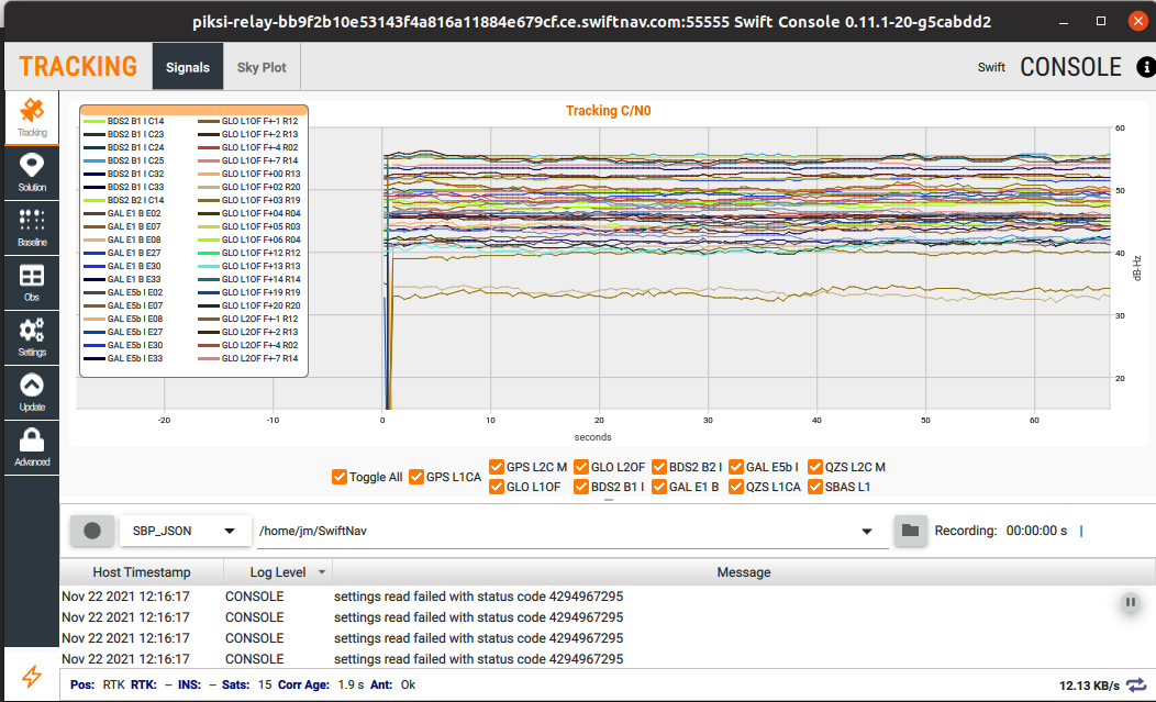
Additionally, the only tab that has had it's subtabs pushed up to this new TabInfoBar is the Tracking tab.
All other tabs are using the new MainTab type, but do not fill it with the desired subtabs to show.