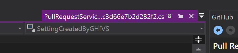
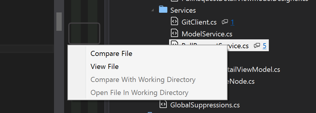
Added extra items to file menu in PR details view. #1036
Conversation
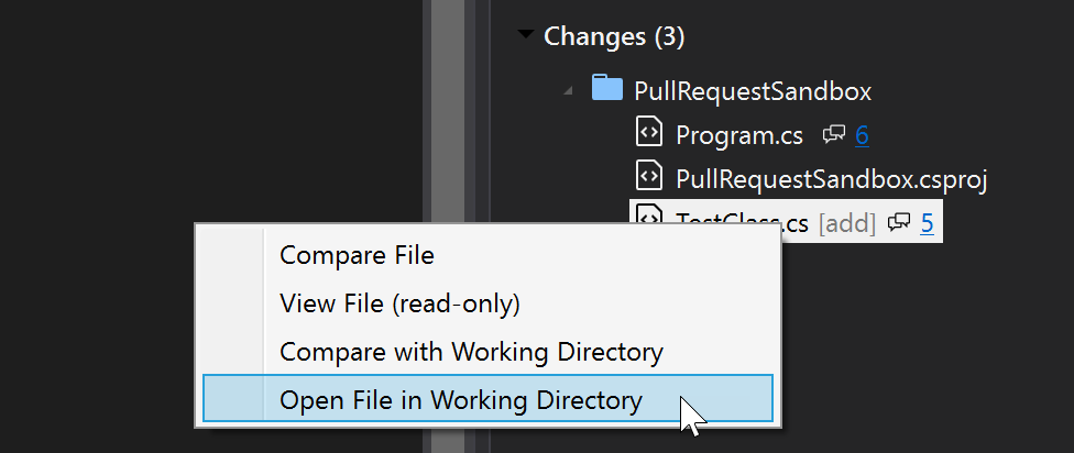
There are now four options:

- Compare File
- View File
- Compare File With Working Directory
- Open File In Working Directory
|
We should maybe deal with the following as part of this PR: #1004 (review)
|
|
At the moment the
We should also make them available when the PR has been merged with the current branch (e.g. when looking at an old PR that has already been merged). |
|
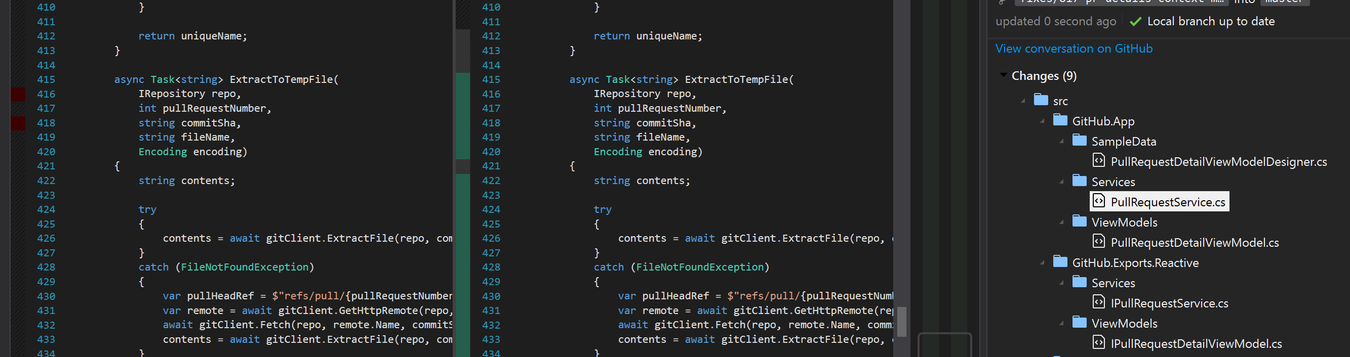
Something funny seems to be going on. I'm using The margin seems to think there are changes, but not the diff view. 😕 |
|
There's also a unit test complaining that |
| </data> | ||
| </root> | ||
| <data name="CompareFileWithWorkingDirectory" xml:space="preserve"> | ||
| <value>Compare With Working Directory</value> |
There was a problem hiding this comment.
I think, "Compare with Working Directory" might look better.
There was a problem hiding this comment.
Visual Studio seems to mainly use title casing even on articles and prepositions, for example "Edit -> Insert File As Text", "Edit -> Bookmark -> Previous Bookmark In Document" (although it is inconsistent - it uses e.g. "Attach to Process"). I agree though, it does look better to me the way you suggested...
| <value>Compare With Working Directory</value> | ||
| </data> | ||
| <data name="OpenFileInWorkingDirectory" xml:space="preserve"> | ||
| <value>Open File In Working Directory</value> |
There was a problem hiding this comment.
Again, maybe change this to "Open File in Working Directory".
| <data name="OpenFile" xml:space="preserve"> | ||
| <value>Open File</value> | ||
| <data name="ViewFile" xml:space="preserve"> | ||
| <value>View File</value> |
There was a problem hiding this comment.
Users could easily miss the fact that the "Working Directory" commands are writable.
Maybe change this label to, "View File (read-only)"?
There was a problem hiding this comment.
Similarly with "Compare File (read-only)" above.
|
I think my preference would be to simplify the menu slightly to this:
(here's the current layout for comparison)
Having used various iterations of this functionality, I have to wonder if having the
Simplifying it to 3 options gets it more under control. What do you think? |
|
Hmm, not sure:
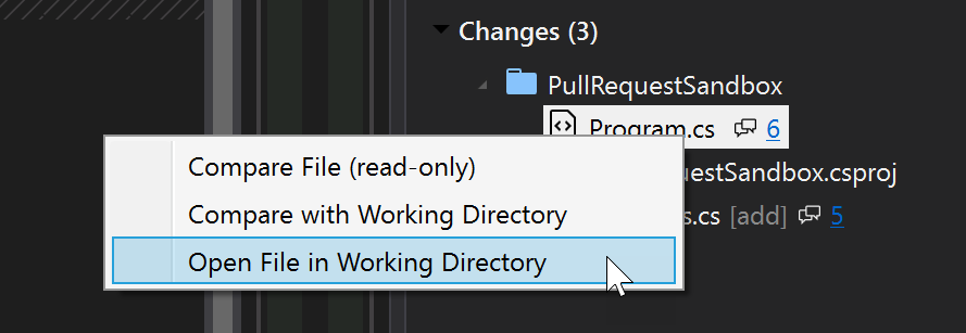
I actually find the screenshot of the menu you posted more cluttered than the current one, with the "(read only)" in there and lack of symmetry, but maybe it's just because I'm not used to it. As ever though, I'll defer the decision to someone who is better at UX than me - @donokuda? |
I'm curious when you might find it useful? I think the PR file is only really of interest relative to the PR/merge base. Standalone it doesn't let you navigate or highlight info/warnings (e.g. superfluous using statements). It's just extra mental load then choosing which option to go for.
Yup, I get it. The thing is,
Fair point.
How about this:
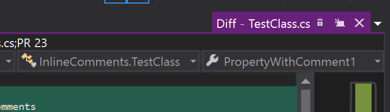
At the moment when we open a Diff, the tab looks like this:
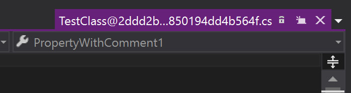
Compared to when we
Perhaps we could prefix the file with |
|
I'm going to be sad when actively working on a PR that the default action isn't to open a live version of that file. 😢 I get what @shana says about the changing behavior being potentially surprising, but I'll have to train myself to not use the default action but one of the A better option might be to make |
@jcansdale Contextually, we are in the PR details window, and we are showing a list of files with a header saying "Changes". The most obvious action that can reasonably happen from this context when the user double clicks the file on the changes list is:
A diff that includes markers for all the changes that occurred in the PR PLUS all the changes that have ocurred locally that haven't yet been pushed is a complex view that is mixing two completely separate pieces of information, with no visual distinction between which ones are coming from the local directory and which ones are coming from previous commits. For a user to understand what is going on in a view like this, they should open it with a clear intention - clicking on an action that clearly states that it is going to open a live diff that mixes all the changes together in one view. You don't need this intention because you wrote it, you know exactly how it works, but users don't, and they can't guess at what's happening. We need to be focused on what the default actions are, what their context is, and how the users will use them based on the context we establish. The PR details view is part of a code review workflow. We established the maintainer workflow as part of a pair of maintainer and contributor workflows where a maintainer reviews PRs and sends feedback to the contributor, and where we fill in the gaps for all the missing steps that users need to do manually in order to review a PR. That is the context in which these features are being built - a code review process. In this context, the user focus is to review the changes made by someone else and provide feedback on them. Having the file click action show show a live diff view by default isn't the most valuable action for this workflow.
Opening the file in the working directory doesn't work towards the goal of providing the user with a quick tool for reviewing changes, which is the purpose of the code review workflow. As for having different defaults depending on the branch you're in, that's definitely something we should not be doing. Human-computer interface guidelines everywhere will tell you that you never ever change what an action does without changing it's UI completely. We're training users to expect an action to happen when they click on a thing, and changing what it does based on some arbitrary hidden logic that they can't guess at will only confuse and frustrate users. |
 Conflicts:
	src/GitHub.App/Services/PullRequestService.cs
	src/GitHub.App/ViewModels/PullRequestDetailViewModel.cs
	src/GitHub.VisualStudio.UI/Resources.resx
	src/GitHub.VisualStudio/UI/Views/PullRequestDetailView.xaml.cs
	src/UnitTests/GitHub.App/Services/PullRequestServiceTests.cs
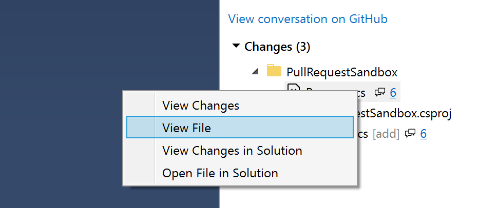
We now have:

- View Changes
- View File
- Open File In Solution
- Compare With Solution
 Conflicts:
	src/GitHub.VisualStudio.UI/Resources.resx
|
@jcansdale updated to use (hopefully) final naming if you want to give some 👀 . |
|
Here's what is looks like now for reference: I think the naming is fine now. 👍 Now that comments are no longer appear on the editor window, I have even more reservations about the usefulness of Given that commands are a lot easier to add then remove, my preference would be to remove this for the moment and revisit it a future release. I know we're up against it time wise and certainly don't want to block this it others have feelings in the opposite direction! I wanted to at least mention it though... |
There are now four options: