4 scRNA: Integration
With ever increasing inter-institutial collaboration and larger atlas projects proper batch correction is becoming a larger problem. Samples spanning locations, laboratories, and conditions lead to complex, and nested batch effects across data.
The most common use-case is to make sure that two data sets are comparable and differences captured are not just from experimental artifacts.
What is the difference between a batch effect and a biologically relevant difference?
Batch effects represent **unwanted** technical variation in data. These are question dependent but generally include:- Variations in sequencing depth
- Sequencing lanes
- Read length
- Processing plates/wells
- Differences in protocols
- Differences in laboratories
- Sample handling differences
- Sample acquisition
- Sample handling
- Processing time
- Differences in reagents
While biologically relevant differences can include things like:
- Spatial differences or sampling site changes
- Interindividual variation
- Differences in sample type/treatment
- Differences in cell types or cell type proportions
- Differences in cell cycle states
However, beyond just batch correction, integration can be used for a variety of additional analyses:
Note
- Batch correction.
- Cell type labelling using an existing pre-labeled data set.
- Combining different measured modalities (for instance, ATAC and RNA).
- Correcting for cell state differences.
Many methods exist to this end, with differing strengths and weaknesses. And depending on the method, they output various stages of analysis including a corrected matrix (like a scaled counts matrix), or simple cell embeddings (like a umap).
When removing batch effects from omics data, there are two major choices:
- The method you will use.
- The parameters (or covariates) that you will include as "batches".
Warning
- The thing to keep in mind is always the balance between biological variation and technical variation. The finer you go on defining batches, the most biology you might be masking. Over correcting of batch effect can mask real biological differences!
Luecken et al. 2022 provided a great benchmarking and state of the field work that is well worth reading. They tested 49 different outputs from multiple algorithms and noted that the most challenging batch effects to correct for in their benchmarking analysis on scRNA data sets were species, sampling location, and single-nucleus/single-cell RNA library preparations.
A comprehensive view on best practices is available as a part of the single-cell best practices e-book.
For a quicker read, you can check the overview provided by 10x Genomics newsletter .
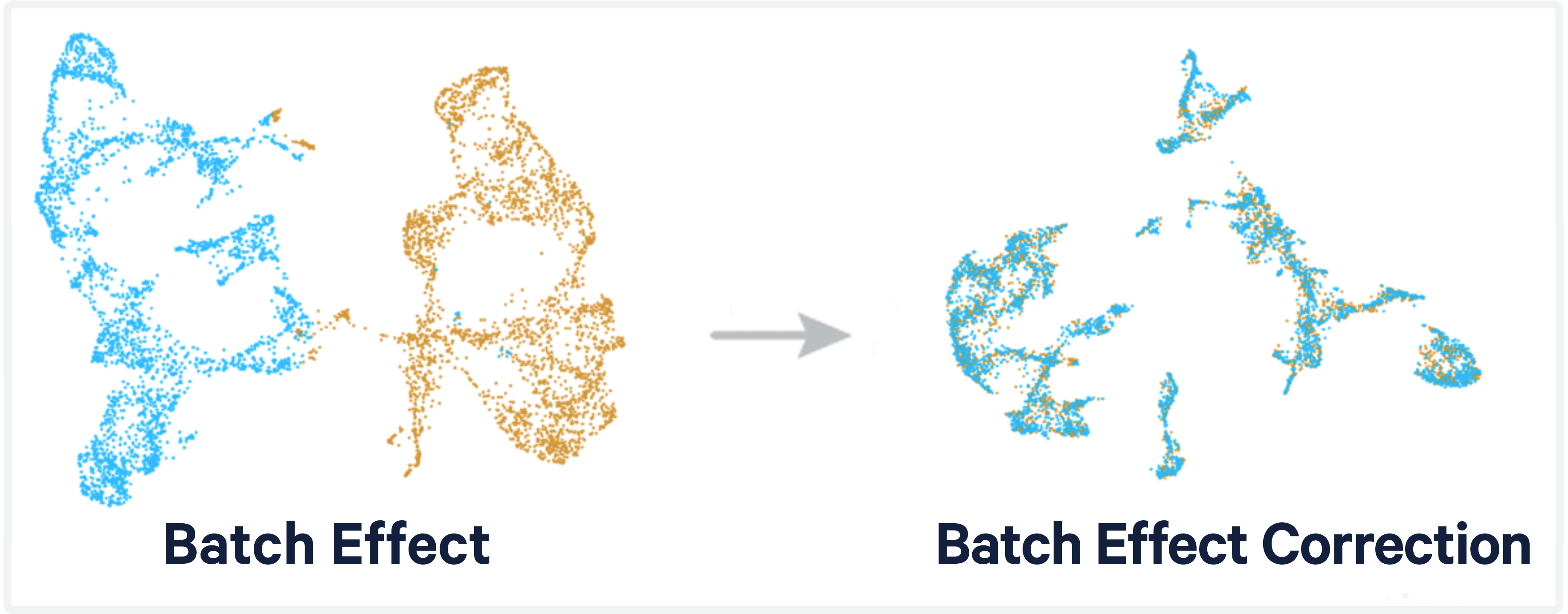
The peril is that we want to correct data sets without snuffing out any of the true biological signals. Today, we'll be testing out some of the integration methods listed in the Luecken et al. paper.
We're going to integrate two scRNA datasets that use different chemistry: FLEX and 3' RNA data on the same human breast sample (BCMHBCA81R), respectively. These have been generated from the same dissociated cells to mitigate sampling biases.
| 3' PolyA | Flex |
|---|---|
| In the 3' PolyA capture chemistry, polyadenylated transcripts are captured and reverse transcribed into cDNA. | In the Flex chemistry, a large library of probes with sequence specificity are annealed directly to RNA and ligated together. Completed ligated molecules are then captured and amplified. |
 |
Caution
The differences in approach and capture targets can lead to some big differences in the data. But let's see if integration could help us find the robust biological signals underlying the two strategies.
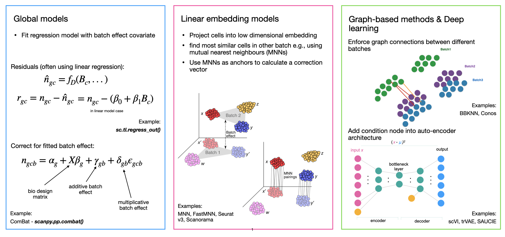
Most integration methods use three general steps:
- Dimensionality Reduction
- Modeling and removing batch effects
- Projection back into high-dimensional space
There are multiple ways to accomplish this second step, today we'll be using three methods which use linear embedding models (CCA, RPCA, Harmony, and FastMNN). Though there are alternative strategies that include deep learning (variational autoencoders), or global models (bulk signals).
Data can be accessed in two ways.
-
Data can be downloaded off the CSHL server
scp -r [USER]@bamdev3.cshl.edu:/grid/singlecellcourse/home/mulqueen/integration_workshop/ ~/DownloadsGenerated with the flex protocol.
Located here:
~/Downloads/integration_workshop/BCMHBCA81R_10xfix/sample_filtered_feature_bc_matrixGenerated with the universal 3' protocol.
Located here:
~/Downloads/integration_workshop/BCMHBCA81R_intron/filtered_feature_bc_matrixBecause the data is going to go through similar preprocessing, we can write a function and use it twice. We'll walk through the processing again quickly, but this early section leans heavily on what you've already learned in the more general scRNA processing workshop.
Data is from the 10x Genomics Cellranger preprocessing (v7.1) and is stored on the CSHL cluster. We will use Seurat functions to read it in to data matrices and then seurat object format.
First lets load up all the packages we will need for this tutorial. These can be loaded at anytime, but it is generally good practice to maintain them at the top of an Rscript in case there are conflicts.
#For plotting
library(patchwork) #install.packages("patchwork")
library(ggplot2) #install.packages("ggplot2")

#For seurat processing
library(Seurat) #install.packages("Seurat")
library(SeuratData) #devtools::install_github('satijalab/seurat-data')
library(SeuratWrappers) #remotes::install_github('satijalab/seurat-wrappers')

#For integration functions
library(harmony) #install.packages("harmony")
library(batchelor) #BiocManager::install("batchelor")

#For reproducibility
set.seed(1234)

#Set higher memory limit, which will help with integration
options(future.globals.maxSize= 2000*1024^2)
Now lets read in and preprocess our flex and 3prime data!
#first we will set up our directories, these include the standard output files "barcodes.tsv.gz" "features.tsv.gz" "matrix.mtx.gz"

threeprime_dir <- "/Users/rmulqueen/CSHL_Workshop/BCMHBCA81R_intron/filtered_feature_bc_matrix"
BCMHBCA81Rflex_dir <- "/Users/rmulqueen/CSHL_Workshop/BCMHBCA81R_10xfix/sample_filtered_feature_bc_matrix"

list.files(threeprime_dir)
list.files(BCMHBCA81Rflex_dir)
This section goes line by line as a review of preprocessing data in Seurat, but you can skip ahead to "Wrapping it all into a function to rerun the Flex data" if you feel comfortable with processing early stages.
Now, we will define our function using the basic Seurat preprocessing that we learned previously. You can also review an example from Seurat's website here.
Lets go about building up our function before we wrap it all together. Ultimately, we want our function to look like this:
Note
preprocessing_data function
| Section | Step |
|---|---|
| Object Creation |
|
| Cell filtering |
|
| Linear dimensionality reduction |
|
| Non-linear visualization |
|
| Identify cell types by marker genes |
|
| Return processed data |
|
It looks like a lot, but each of these is about one line each, so the full function won't look much bigger!
For the sake of brevity, we will be using the pre-filtered output of cellranger. This includes some basic assumptions about data filtering, basically it has already assigned which droplets contain cells by read count cutoffs.
Lets start with our 3 prime data.
threeprime_rna <- Read10X(
  threeprime_dir, #use the 3 prime directory to look for files
  gene.column = 2, #gene names are in the 2nd column (10x standard)
  cell.column = 1, #cell IDs are in the 1st column (10x standard)
  unique.features = TRUE, #filter out any duplicate feature names
  strip.suffix = FALSE#keep the full suffix
)

#add the rna sparse matrix to a seurat object
threeprime <- CreateSeuratObject(counts = threeprime_rna)

#lets get a sense of the structure of the data
str(threeprime)

#we can follow the object slots down to get specific info
threeprime@meta.data$nCount_RNA

#and we can summarize it to get a sense of thresholding
summary(threeprime@meta.data$nCount_RNA)
You may notice that in the creation of the Seurat object the @meta.data slot included orig.ident, nCount_RNA, and nFeature_RNA, these last two are the counts of total counts [colSum(dat_matrix)] of the data matrix, and the count of unique features [colSum(dat_matrix>0)] for each cell.
Lets get a sense of what this looks like currently.
summary(threeprime@meta.data$nFeature_RNA)
Let's require that cells have over 1,000 genes transcribed, but less than 10,000. This will filter out those empty GEMs and remove potential duplicates as well.
threeprime <- subset(threeprime, subset = nFeature_RNA > 1000 & nFeature_RNA < 10000)

#filter low quality cells, or high read count cells (potentially doublets)
threeprime
Nice! But we still have a lot of features, and most of them aren't very informative for grouping cells.
We want to whittle down those features to those with the most variance, because those will provide the highest signal-to-noise ratio in describing our data.
Unlike in the first tutorial, we will do normalization and scaling more manually rather than using the SCTransform wrapper funciton.
threeprime <- NormalizeData(threeprime)

threeprime <- FindVariableFeatures(threeprime, nfeatures = 2000) #find informative (variable) features

VariableFeatures(threeprime) #lets take a look at the variable features

threeprime <- ScaleData(threeprime)

threeprime <- RunPCA(threeprime, features = VariableFeatures(object = threeprime))
#this outputs a list of top loaded features per PCA, both those which are positively and negatively correlated with each factor

threeprime <- FindNeighbors(threeprime, dims = 1:30) #group cells in PCA space by their distances

threeprime <- FindClusters(threeprime, resolution = 0.2) #define distance cut-offs to identify clusters
Now, we can visualize our high dimensional data on a 2D plot to get a sense of clusters and cell types. We'll use the first 10 PCs for clustering.
threeprime <- RunUMAP(threeprime, dims = 1:30,reduction="pca",reduction.name = "umap.unintegrated") #perform umap/tsne to visualize cells and clusters


umap_plt<-DimPlot(threeprime,group.by="seurat_clusters")

umap_plt
Now, we have a UMAP projection of our cells!

First lets sanity check by rerunning on the threeprime data.

Lets set up our function with two arguments.
- 'SeuratObj' is the initial seurat object that we can pass in
- 'cluster_name' is the name we want to add to the data set (so we can tell flex cells apart from 3prime cells)
# run standard analysis workflow
initial_processing<-function(SeuratObj, cluster_name){
  SeuratObj  <- subset(SeuratObj , subset = nFeature_RNA > 1000 & nFeature_RNA < 10000)
  SeuratObj <- NormalizeData(SeuratObj, verbose = FALSE)
  SeuratObj <- FindVariableFeatures(SeuratObj, nfeatures = 2000) #find variable expression
  SeuratObj <- ScaleData(SeuratObj, verbose = FALSE)
  SeuratObj <- RunPCA(SeuratObj,features=VariableFeatures(SeuratObj)) #run PCA
  SeuratObj <- FindNeighbors(SeuratObj, dims = 1:30, reduction = "pca") #find cell neighborhoods for clustering
  SeuratObj <- FindClusters(SeuratObj, resolution = 0.2, cluster.name = cluster_name) #define clusters
  SeuratObj <- RunUMAP(SeuratObj, dims = 1:30, reduction = "pca", reduction.name = "umap.unintegrated") #run UMAP for 2d visualization
  return(SeuratObj)
}
3prime first to test if we get the same output
threeprime_rna_mat <- Read10X(BCMHBCA81R_3prime_dir,
                              gene.column = 2,
                              cell.column = 1,
                              unique.features = TRUE,
                              strip.suffix = FALSE) # read in 10x data

threeprime <- CreateSeuratObject(counts = threeprime_rna_mat,
                                project="threeprime") # add RNA matrix to a seurat object

threeprime<-initial_processing(SeuratObj=threeprime,
                              cluster_name="threeprime_clusters")

#the structure of the seurat object can be seen with this call:
str(threeprime)

#you can follow the slots of the object down the hierarchy to get the information you want
str(threeprime@meta.data)

#lets plot the Dim Plot to check that our function worked
umap_func_plt<-DimPlot(threeprime,group.by=c("threeprime_clusters"))

umap_plt | umap_func_plt

There are many resources to help with cell typing, particularly for 10x Genomics' more widely used RNA kits. We will use the same markers from the scRNA introduction module for cell typing. But I highly recommend looking through these other resources for your own data in the future.
For our purposes, and since we are only working with few cells, lets stick to broader classifications from the Human Breast Cell Atlas and try to keep it around 1-4 markers for broad cell types.
#refine cell typing with marker genes
# Here is a named list of marker genes per cell type:
hbca_markers <- list(
  'Basal'=c('KRT14','KRT17','DST'),
  'LumHR'=c('AREG','ERBB4','AGR2'),
  'LumSec'=c('SCGB2A2','SLPI','KRT15'),
  'Endo'=c('SELE','FABP4','CSF3'),
  'Pericytes'=c('RGS5','MT1A','IGFBP5'),
  'B cells'=c('MZB1','CD79A','DERL3'),
  'Fibro'=c('DCN','APOD','COL1A1'),
  'T cells'=c('CD3D','CD3E','CD2'),
  'Myeloid'=c('CD68','C1QC','MS4A6A')
)
Looking at our marker plots, we can assign the rough cell typing for both threeprime and flex objects. Remember that cell type identification is an iterative process. Clusters can be more coarsely or granularly defined so it is always important to go back and check through steps. This will be useful in checking how well our different integration strategies perform.
threeprime chemistry cell types using dotplot of marker genes:
dimplt<-DimPlot(threeprime,group.by=c("threeprime_clusters"))

dotplot<-DotPlot(threeprime,hbca_markers)+theme(axis.text.x = element_text(angle = 90))

dimplt/dotplot

threeprime <- RenameIdents(object = threeprime,
                               "0" = "LumSec",
                               "1" = "LumSec",
                               "2" = "Fibro",
                               "3" = "Basal",
                               "4" = "Endo",
                               "5" = "LumHR",
                               "6" = "Tcells",
                               "7" = "Pericytes",
                               "8" = "LumSec",
                               "9" = "Myeloid",
                               "10" = "Bcells",
                               "11" = "Unknown")

threeprime$celltype<-Idents(threeprime)

dotplt<-DotPlot(threeprime,
                hbca_markers,
                group.by="celltype") +
        theme(axis.text.x = element_text(angle = 90))

dimplt<-DimPlot(threeprime,
                group.by=c("threeprime_clusters","celltype"))

dimplt/dotplt

saveRDS(threeprime, "threeprime.HBCA81R.seuratobj.rds")

Lets repeat this with our flex chemistry now by using the same function for processing.
Flex chemistry assignment
flex_rna_mat <- Read10X(BCMHBCA81Rflex_dir,
                        gene.column = 2,
                        cell.column = 1,
                        unique.features = TRUE,
                        strip.suffix = FALSE) # read in 10x data

flex <- CreateSeuratObject(counts = flex_rna_mat,
                          project="flex") # add RNA matrix to a seurat object

flex <- initial_processing(SeuratObj=flex,
                          cluster_name="flex_clusters")

dimplt<-DimPlot(flex,group.by=c("flex_clusters","celltype"))

dotplot<-DotPlot(flex,hbca_markers)+theme(axis.text.x = element_text(angle = 90))

dimplt/dotplot

flex <- RenameIdents(object = flex,
                               "0" = "LumSec",
                               "1" = "LumSec",
                               "2" = "Fibro",
                               "3" = "Endo",
                               "4" = "Basal",
                               "5" = "LumHR",
                               "6" = "Pericytes",
                               "7" = "Tcells_Bcells",
                               "8" = "Tcells",
                               "9" = "Myeloid",
                               "10" = "LumSec")

flex$celltype<-Idents(flex)

dotplt<-DotPlot(flex,hbca_markers,group.by="celltype")+theme(axis.text.x = element_text(angle = 90))

dimplt<-DimPlot(flex,group.by=c("flex_clusters","celltype"))

dimplt/dotplt

saveRDS(flex, "flex.HBCA81R.seuratobj.rds")

We can process the data with the same preprocessing function.
Running the initial preprocessing will show the problem that we face, the data, despite being the same sample, does not overlap due to the technical differences.
#merge allthe data together without integrating

merged_dat<-merge(threeprime, y = flex, add.cell.ids = c("3prime", "flex"))

merged_dat<-initial_processing(SeuratObj=merged_dat, cluster_name="unintegrated_clusters") #run preprocessing on merged

unintegrated_plt<-DimPlot(merged_dat,group.by=c("celltype","orig.ident"),label=TRUE)  & NoAxes() & NoLegend()

unintegrated_plt

Caution
Gross, dude. They still cluster by celltype but the do not combine across methods.
I know I already mentioned it, but it bears repeating; there are many integration methods available, each with their own strengths. The study by Luecken et al. is a really great comprehensive view of the field of integration for both RNA and ATAC data. https://www.nature.com/articles/s41592-021-01336-8
Because we are using merge to combine our data, we are split across layers by method (threeprime/flex) in the Seurat object.
Note
This is a feature of Seurat v5, for earlier versions, you have to specify the metadata column that contains your batch information.
We can than use Seurat's IntegrateLayers function with a couple of different methods to test how well the integration works. The independently labelled cell types will be our gold standard to see how they do.
Lets first downsample so we can run these integrations faster.
#downsample works on the set identities so lets set them back to methods so we can evenly downsample
table(merged_dat$orig.ident)

#      flex threeprime
#      6015      13778

Idents(merged_dat)<-merged_dat$orig.ident

merged_dat<-subset(merged_dat,downsample=2000)

table(merged_dat$orig.ident)

#      flex threeprime
#      2000       2000

#now that we are down to just 4000 cells we can integrate much faster

#our data is split into layers
merged_dat <- IntegrateLayers(
  object = merged_dat, method = CCAIntegration,
  orig = "pca", new.reduction = "integrated.cca", verbose=FALSE)

merged_dat <- IntegrateLayers(
  object = merged_dat, method = RPCAIntegration,
  orig = "pca", new.reduction = "integrated.rpca",verbose=FALSE)

merged_dat <- IntegrateLayers(
  object = merged_dat, method = HarmonyIntegration,
  new.reduction = "integrated.harmony",verbose=FALSE)

merged_dat <- IntegrateLayers(
  object = merged_dat, method = FastMNNIntegration,
  orig.reduction = "pca", new.reduction = "integrated.mnn",verbose=FALSE)
Lets define another function to speed things up. This one will cover UMAP projection and plotting.
#we're suppling the same seurat object each time, so no need to have that as an argument.
#lets just have the reduction name (the integration strategy) as input.
#and lets have the output be the umap plot

plot_integrations<-function(integration_method){
	merged_dat <- RunUMAP(merged_dat, dims=1:30,
		                    reduction = integration_method, assay="RNA",
		                    reduction.name=paste0(integration_method,"_umap"))

	plt <- DimPlot(merged_dat,
            	  group.by = c("celltype",'orig.ident'),
            	  reduction=paste0(integration_method,"_umap"),
            	  alpha=0.5,
            	  label=TRUE) &
        ggtitle(paste0(integration_method,c("_clusters","_tech"))) &
        NoAxes() &
        NoLegend()

	return(plt)
}
This function will take in name of the integration method, listed in the 'new.reduction' argument for each integration. Because it is using the same seurat object, we dont need to add that as an argument.
We are using R's special function "lapply" which applies one function to every element of a list.
In this case, our list is all the integration 'new.reduction' names, and the function will be the plotting one we just defined.
This means we are getting a list of plots returned.
plt_list<-lapply(c("integrated.cca",
                  "integrated.rpca",
                  "integrated.harmony",
                  "integrated.mnn"),
                  plot_integrations)

#we can add the unintegrated plot to the front of the list

full_list<-c(list(unintegrated_plt ),plt_list)

#and then we use patchwork's wrap plot function to combine them all

wrap_plots(full_list, ncol=1)

Lets see how they did with the default settings!
In this example, we set ourselves up for success because we used the same cell dissociation. But remember this can be much more difficult, especially when merging public data with your own. Don't shy away from reading deeper into the function arguments to further optimize the integration.
Note
Observe how some integration methods perform better than others. Remember - we want a balance of conserving the biological information, while decreasing the technical artifacts. Hopefully all celltypes should fully integrate. But remember one method is nuclear RNA focused while the other captures cellular RNA.
I think the CCA, RPCA, and Harmony methods look good.
Note
*For brevity we are eye-balling methods based on our cell type annotations, however we can quantify this as well. Some methods that have been proposed for measuring the success of integration correcting for batch effects and limiting loss of biological information include k-nearest-neighbor batch effect tests (kBET), and the average silhouette width (ASW).
I would look up the R package Seurat-Integrate to apply these metrics.
Lets wrap up with two more examples of what to do with integrated data.
A benefit of data integration is the ability to cell type unknown cells in a more holistic method than just a dozen marker genes.
Lets see how it performs by wiping our labels off the FLEX data set and using our integration to relabel them.
Lets reload the flex and threeprime seurat objects before integration and see if we can transfer labels from one to the other.
threeprime<-readRDS("threeprime.HBCA81R.seuratobj.rds")
flex<-readRDS("flex.HBCA81R.seuratobj.rds")

flex$celltype_markerbased<-flex$celltype #back up our marker based method

#build up our anchors across data sets
anchors <- FindTransferAnchors(
                              reference = threeprime,
                              query = flex,
                              reference.reduction = "pca") #use PCA to find anchor points (shared covariates among cells)

flex_predictions <- TransferData(anchorset = anchors,
                                  refdata = threeprime$celltype) #use the anchor set to take the metadata label 'celltype' and calculate values for flex

flex <- AddMetaData(flex, metadata = flex_predictions) #add these new predictions to the flex data

flex_celltype_predictions<-data.frame(marker_based=flex$celltype,anchor_based=flex$predicted.id) #make a data frame of cell type (our marker based method) and predicted cell types (from the anchor transfer)

#                           marker_based anchor_based
#AAACAAGCAAATAAGGAGTAGGCT-1        LumHR        LumHR
#AAACAAGCAACAAAGAAGTAGGCT-1       LumSec       LumSec
#AAACAAGCAATTAGCGAGTAGGCT-1       LumSec       LumSec
#AAACAAGCATGGTCAAAGTAGGCT-1       LumSec       LumSec
#AAACAAGCATTCTGTAAGTAGGCT-1       LumSec       LumSec
#AAACCAATCGGGCAGTAGTAGGCT-1       LumSec       LumSec

hm <- table(flex_celltype_predictions$anchor_based,flex_celltype_predictions$marker_based) #summarize this list into a table
hm

hm_count<-as.data.frame(hm) #convert it back into a data frame, now with the counts

hm_scale<-as.data.frame(scale(hm,center=F))

colnames(hm_count)<-c("marker_based","anchor_based","count")

hm_count$scaled <- hm_scale$Freq #combine count and scaled data to plot both

ggplot(hm_count, aes(x=marker_based, y=anchor_based, fill=scaled,label=count)) +
  geom_tile() +
  geom_text(color="white") +
  theme(axis.text.x = element_text(angle = 90))

It looks like through label transfer we can say that the small cluster of cells that we labelled as unknown looks most similar to T cells/B cells! So that's something. It also confirmed our suspicions that the small set of markers we used did not separate out this "Tcells_Bcells" population properly. This is likely a cell type that we did not account for in our marker set! Maybe they are another type of immune cell??
Finally lets get a sense of how the methods differ within one cell type.
Lets subset our data to just LumSec cells, then find the differences in markers across methods.
We'll be using the dplyr syntax to speed up some steps. Essentially '%>%' is a PIPE, it takes the output from one function and puts it into the input of the next.
merged_dat[["RNA"]]<- JoinLayers(merged_dat[["RNA"]]) #first we want to join the layers, this is essentially adding the flex and threeprime rna counts matrices together

Idents(merged_dat) <- "celltype" #set the idents to celltype

lumsec.markers <- FindConservedMarkers(merged_dat, ident.1 = "LumSec", grouping.var = "orig.ident", verbose = FALSE) #find conserved

head(lumsec.markers)

flex_enriched <- lumsec.markers %>%
                  filter(flex_avg_log2FC>0) %>%
                  mutate(logdiff = flex_pct.1-threeprime_pct.1) %>%
                  slice_max(order_by=logdiff, n=10)

threeprime_enriched <- lumsec.markers %>%
                  filter(threeprime_avg_log2FC>0) %>%
                  mutate(logdiff = threeprime_pct.1 - flex_pct.1) %>%
                  slice_max(order_by=logdiff, n=10)

dat_sub<-subset(merged_dat,celltype=="LumSec")

DotPlot(dat_sub,
        features= c(row.names(flex_enriched),row.names(threeprime_enriched)),
        group.by="orig.ident",
        scale=FALSE) +
        theme(axis.text.x = element_text(angle = 90))

So from an analysis like this, we can get a list of genes we would expect to see in one method over the other. This is a super useful list to have on hand when using different methods for your analysis.
Note
- Theres plenty more to consider in optimizing these integration methods, despite our data sets being fairly simple comparisons.
- This exercise is left for the reader, but try these same integration methods with numbers of variable gene counts, scaled vs. unscaled data, and differing numbers of integrated dimensions.
Thanks for joining in this data integration workshop! Remember that his workshop chose a pretty slam-dunk case for integration, samples from the same vial of dissociated cells processed by the same hands in the same lab.
I hope this provided a good introduction to integration, there's plenty more to explore with your own data to optimize your science!

For more info about us click here.